SONOS: INTUITIVE CONTROL FOR EVERY LISTENER
SONOS: INTUITIVE CONTROL FOR EVERY LISTENER
ABOUT
Sonos is a consumer audio brand known for its seamless multi-room wireless experience, delivering high-quality sound without the need for cables.
TASK
Independently redesign the Sonos app in response to feedback from loyal users of both the app and the brand. The goal is to improve navigation, enhance the app’s appearance building on the existing UI, and to restore confidence in Sonos among its customers.
TIMELINE
April 18 2025 - May 10 2025
ROLE
UX Designer, UI Designer, Prototyper, Researcher
TOOLS
Figma, Procreate, Illustrator

THE PROBLEM
The idea to redesign the Sonos app arose after a recent update removed key features and buried them in unintuitive menus. While Sonos is known for its premium audio hardware, the app experience does not reflect that same level of quality. The high tap-depth means users often struggle to perform routine actions quickly, which creates a disconnect between the physical product and the app’s usability.
The idea to redesign the Sonos app arose after a recent update removed key features and buried them in unintuitive menus. While Sonos is known for its premium audio hardware, the app experience does not reflect that same level of quality. The high tap-depth means users often struggle to perform routine actions quickly, which creates a disconnect between the physical product and the app’s usability.
WHY IT MATTERS
Sonos core selling point is loyalty, the brand is designed around a multi speaker user. This loyalty means users depend and return to Sonos, when the app falls short, loyalty wavers.
Sonos core selling point is loyalty, the brand is designed around a multi speaker user. This loyalty means users depend and return to Sonos, when the app falls short, loyalty wavers.
THE GOAL
To address the users pain-points, I will redesign the app around three user personas, ensuring core features are easily accessible to all, while offering advanced customisation for more tech-savvy users. Throughout, I prioritised a luxurious yet simple and intuitive interface based off Sonos established UI that balances usability with elegance.
To address the users pain-points, I will redesign the app around three user personas, ensuring core features are easily accessible to all, while offering advanced customisation for more tech-savvy users. Throughout, I prioritised a luxurious yet simple and intuitive interface based off Sonos established UI that balances usability with elegance.
DESIGN PROCESS
I used a clear, end-to-end design process—from research to final solution.
I used a clear, end-to-end design process—from research to final solution.


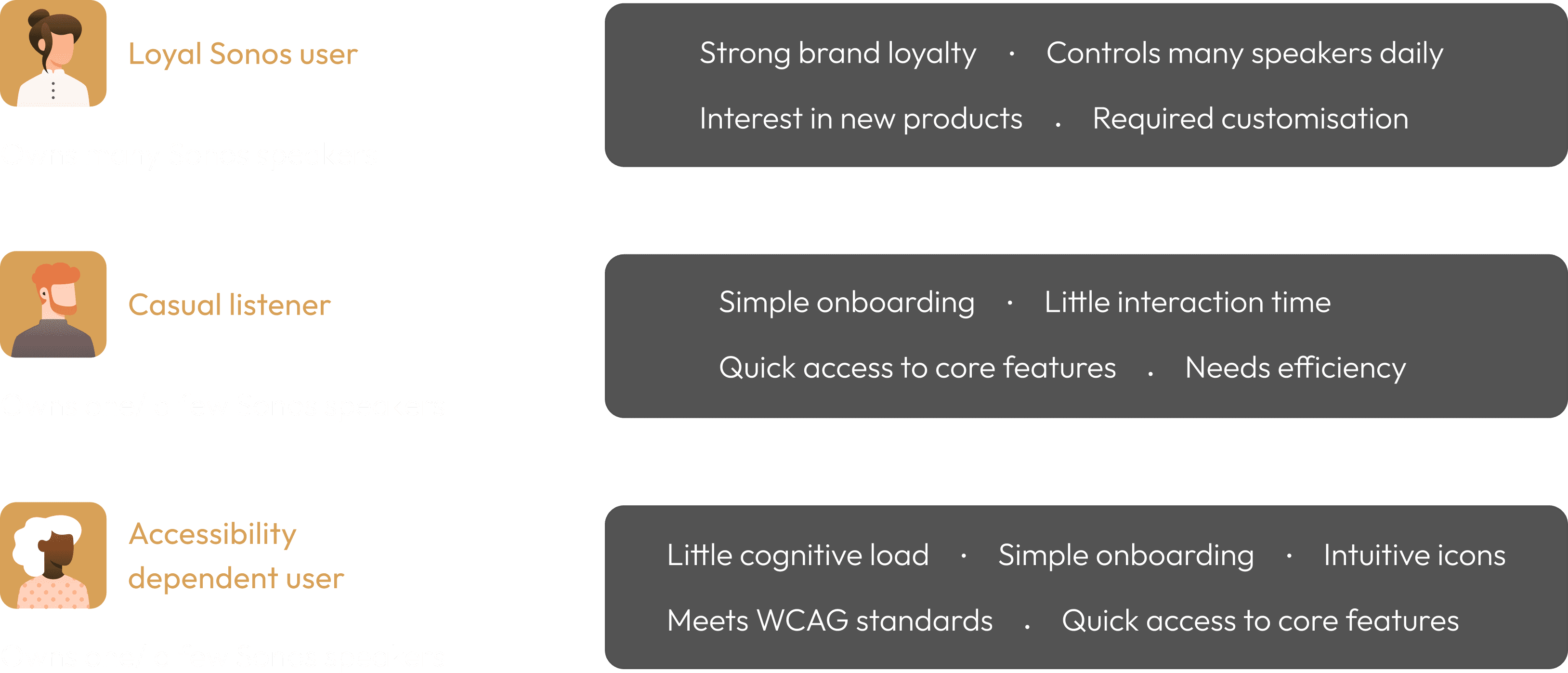
PERSONAS
I grouped users into three distinct personas that best represent the typical traits of individuals who own Sonos speakers—and by extension, use the app.
I grouped users into three distinct personas that best represent the typical traits of individuals who own Sonos speakers—and by extension, use the app.

USER RESEARCH
After the update removed many frequently used features, Sonos users voiced their frustrations across online forums. I conducted research to identify issues users were having.
After the update removed many frequently used features, Sonos users voiced their frustrations across online forums. I conducted research to identify issues users were having.
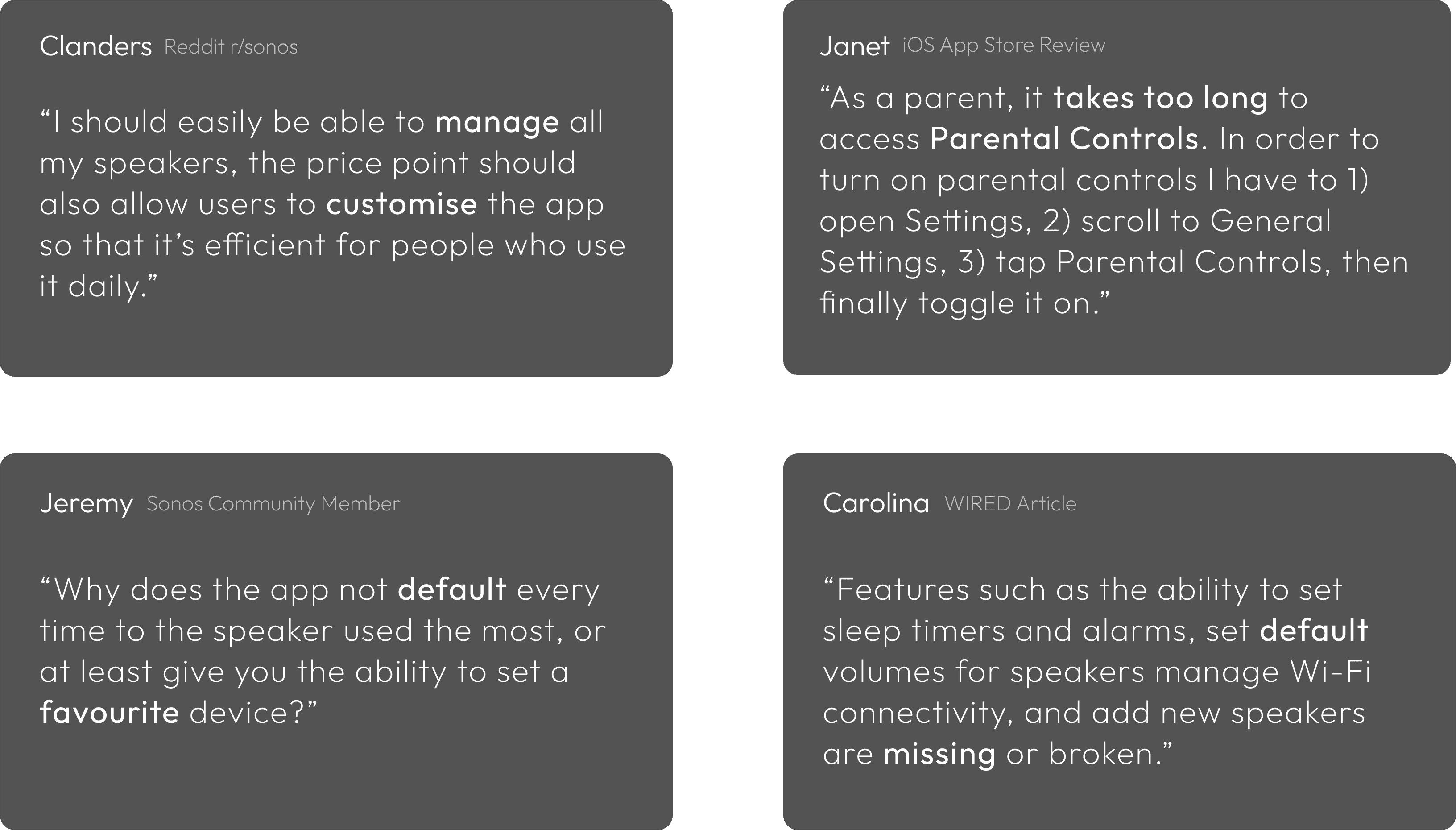

PAIN POINTS
I grouped the most commonly mentioned issues and keywords, into a table highlighting the core reasons behind their dissatisfaction.
I grouped the most commonly mentioned issues and keywords, into a table highlighting the core reasons behind their dissatisfaction.

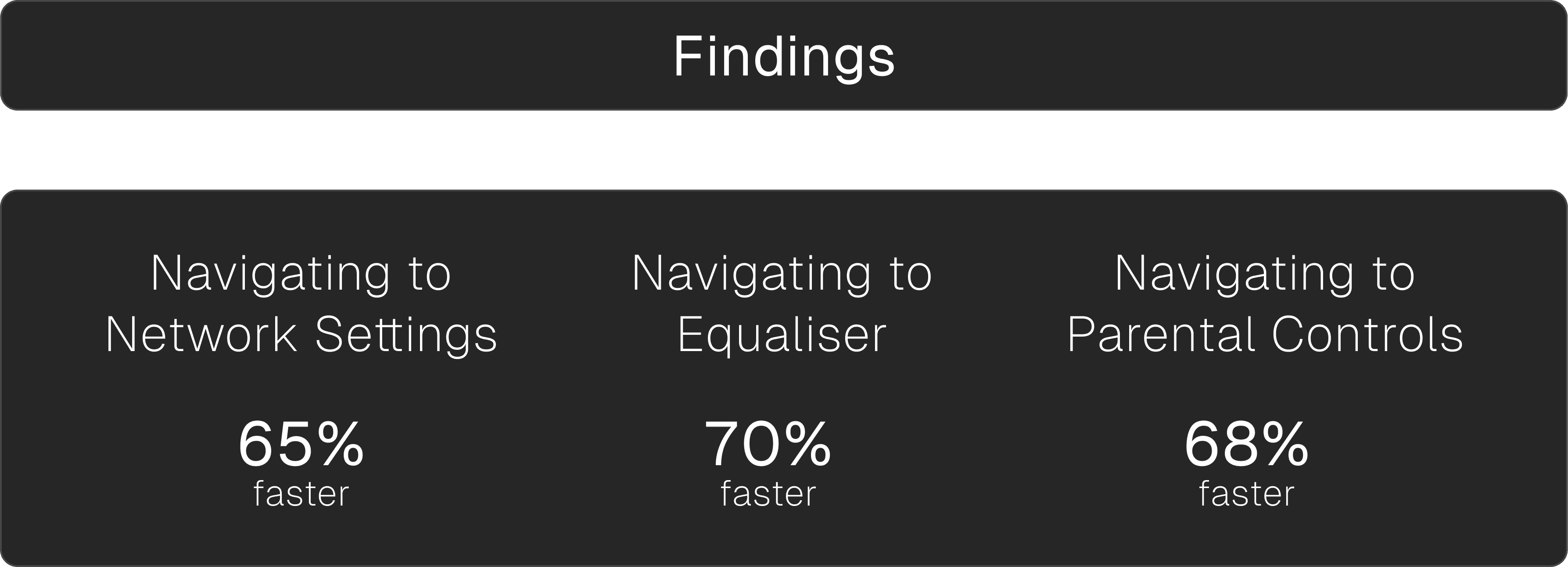
TESTING THE USER FLOW
Accessing commonly used features required navigating through cluttered menus, excessive scrolling, and deep tap paths. The cognitive load was unnecessarily high, even locating something as basic as the equaliser felt burdensome. The UI also largely lacks personality.
Accessing commonly used features required navigating through cluttered menus, excessive scrolling, and deep tap paths. The cognitive load was unnecessarily high, even locating something as basic as the equaliser felt burdensome. The UI also largely lacks personality.
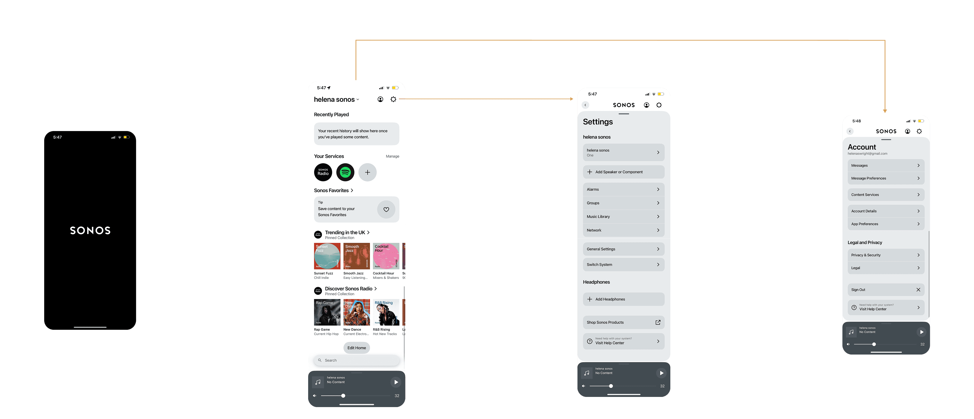
FIG. 1
USER FLOW TO KEY MENUS
USER FLOW TO KEY MENUS
FIG. 1

FIG. 2
DEEPER USER FLOWS
DEEPER USER FLOWS
FIG. 2
3 taps + scrolling to Switch Device
3 taps to get to EQ
4 taps to get to Parental Controls
3 taps + scrolling to Switch Device
3 taps to get to EQ
4 taps to get to Parental Controls
3 taps + scrolling to Switch Device
3 taps to get to EQ
4 taps to get to Parental Controls
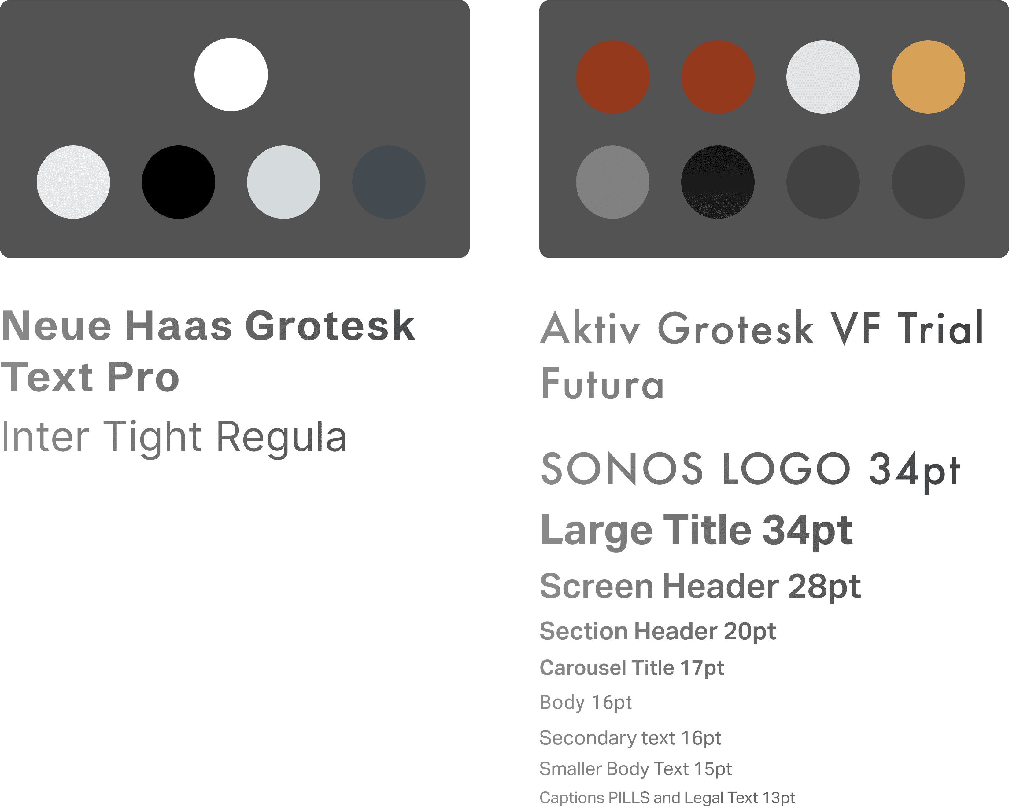
EXISTING BRANDING
In early 2025, Sonos introduced a new colour palette, illustration style, and typeface. Bringing this updated brand identity into the mobile app reinforces the premium experience users expect from Sonos.
In early 2025, Sonos introduced a new colour palette, illustration style, and typeface. Bringing this updated brand identity into the mobile app reinforces the premium experience users expect from Sonos.
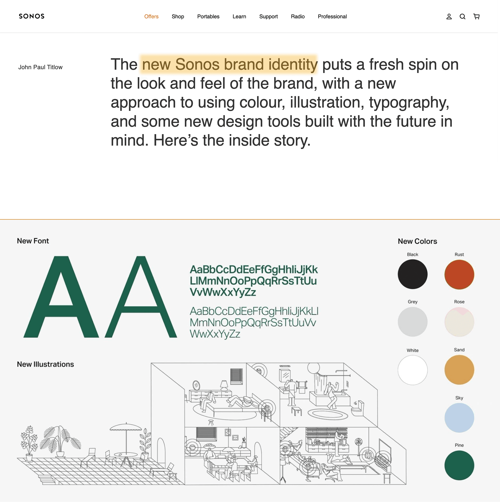
FIG. 3
SONOS BRAND IDENTITY
SONOS BRAND IDENTITY
FIG. 3
REDESIGNING BEGINS…
REDESIGNING BEGINS…
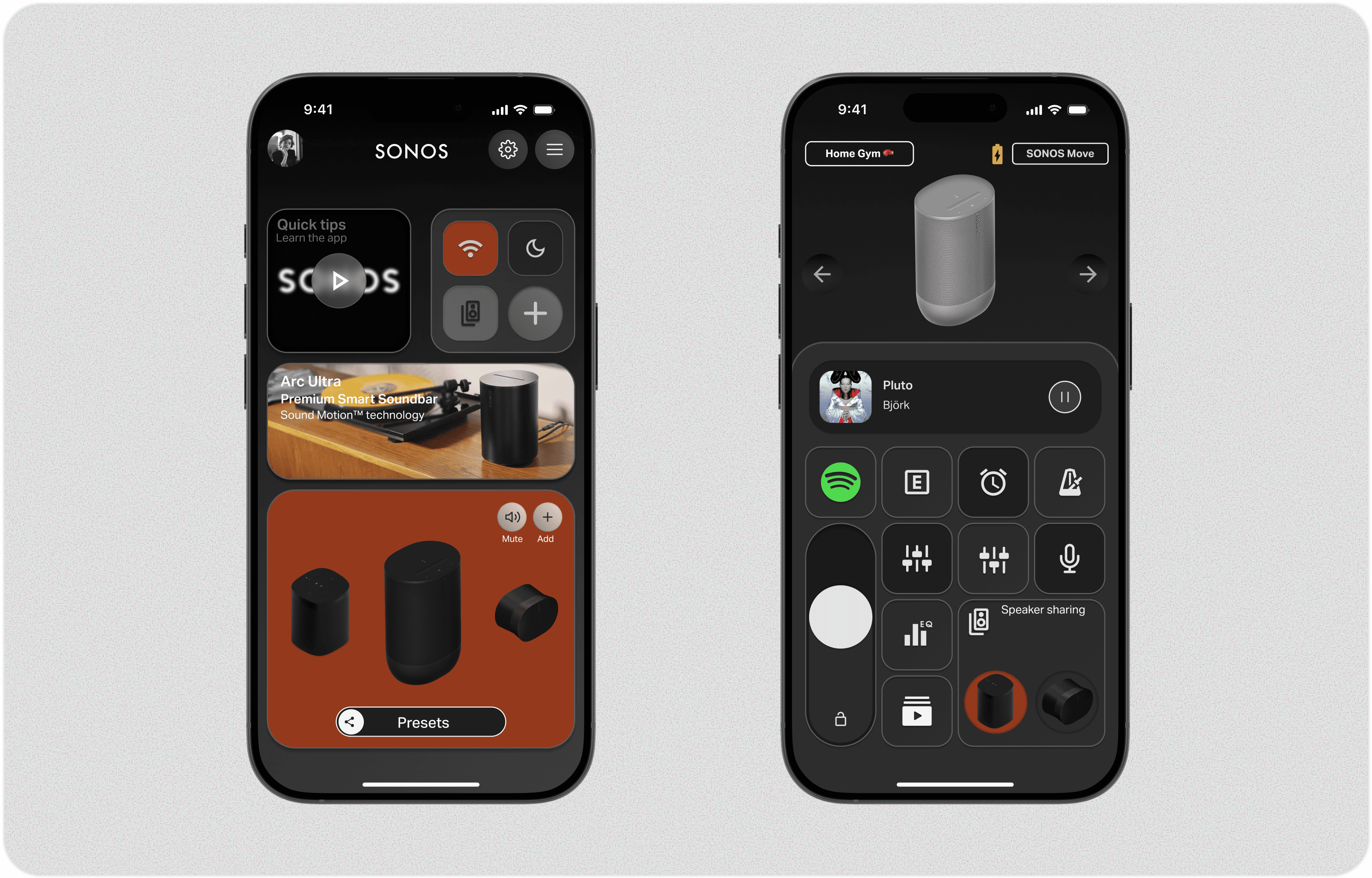
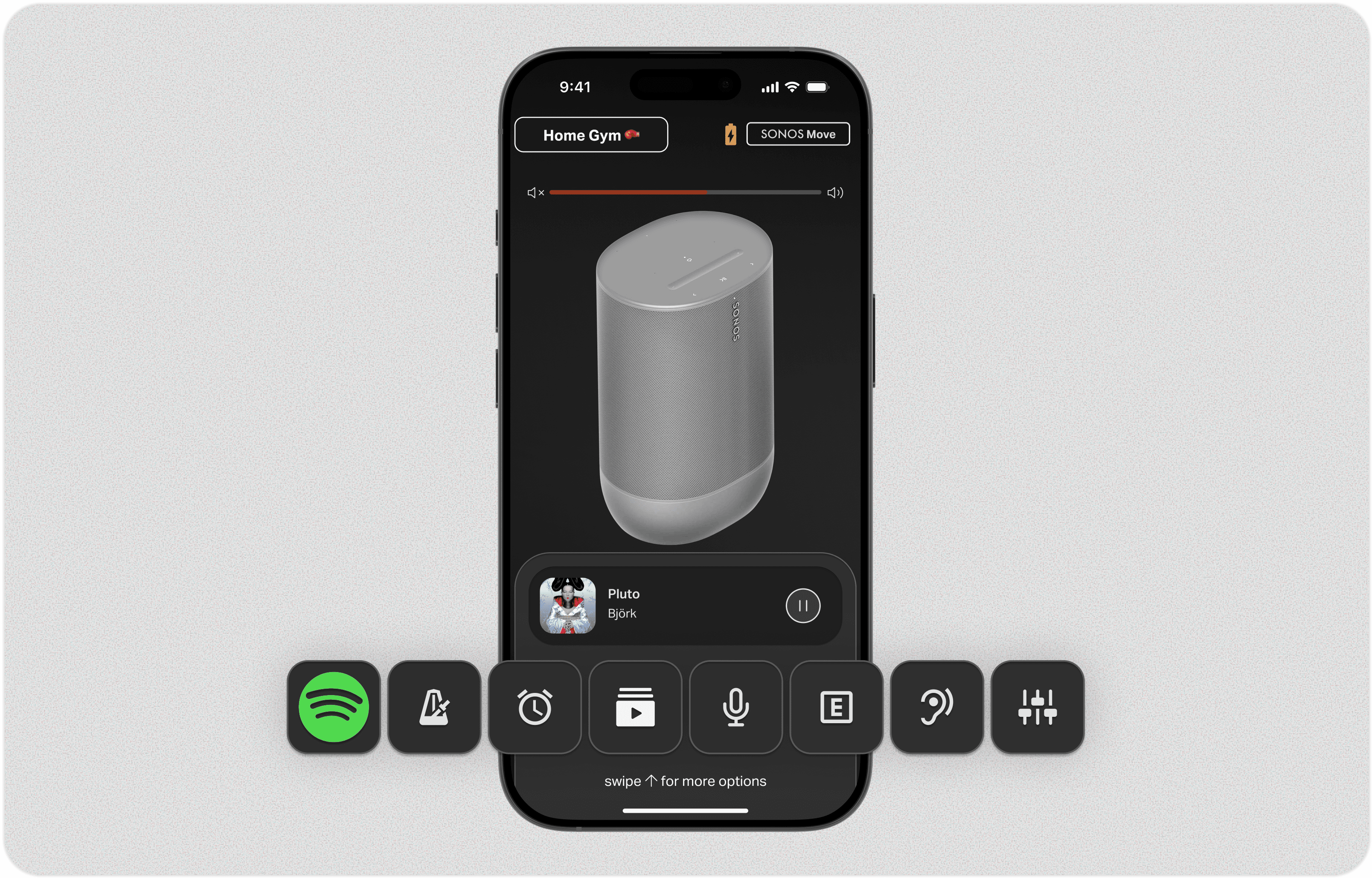
HOMESCREEN
Reimagining the home screen allows it to better reflect user needs through the thoughtful placement of core features—all clearly visible, so users can intuitively navigate where they want to go.
Reimagining the home screen allows it to better reflect user needs through the thoughtful placement of core features—all clearly visible, so users can intuitively navigate where they want to go.
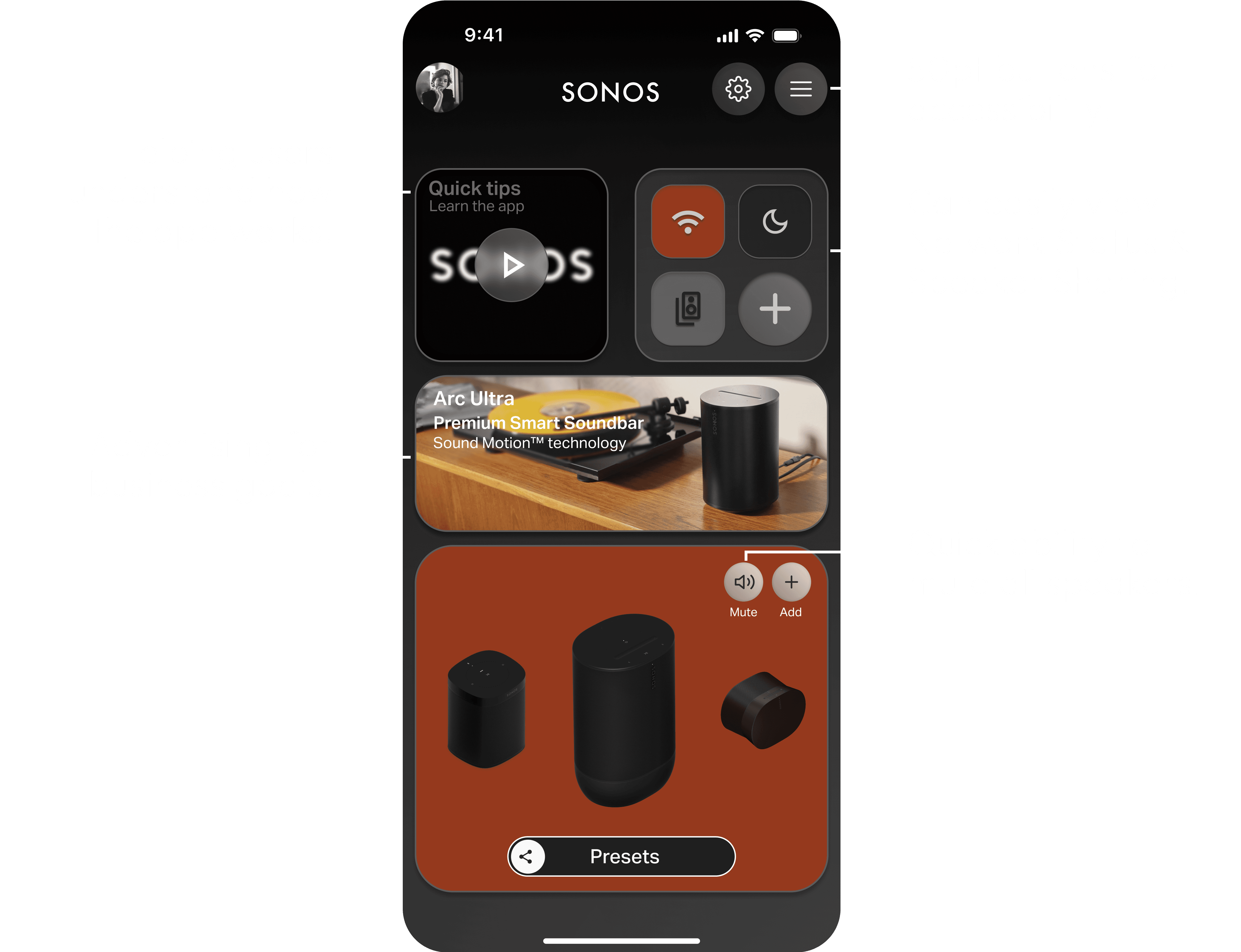
CUSTOMISABLE HOMEPAGE BACKGROUND
Creating a personalised home screen establishes a central hub that encourages users to explore the app’s full capabilities.
Creating a personalised home screen establishes a central hub that encourages users to explore the app’s full capabilities.

SPEAKER SWITCHING
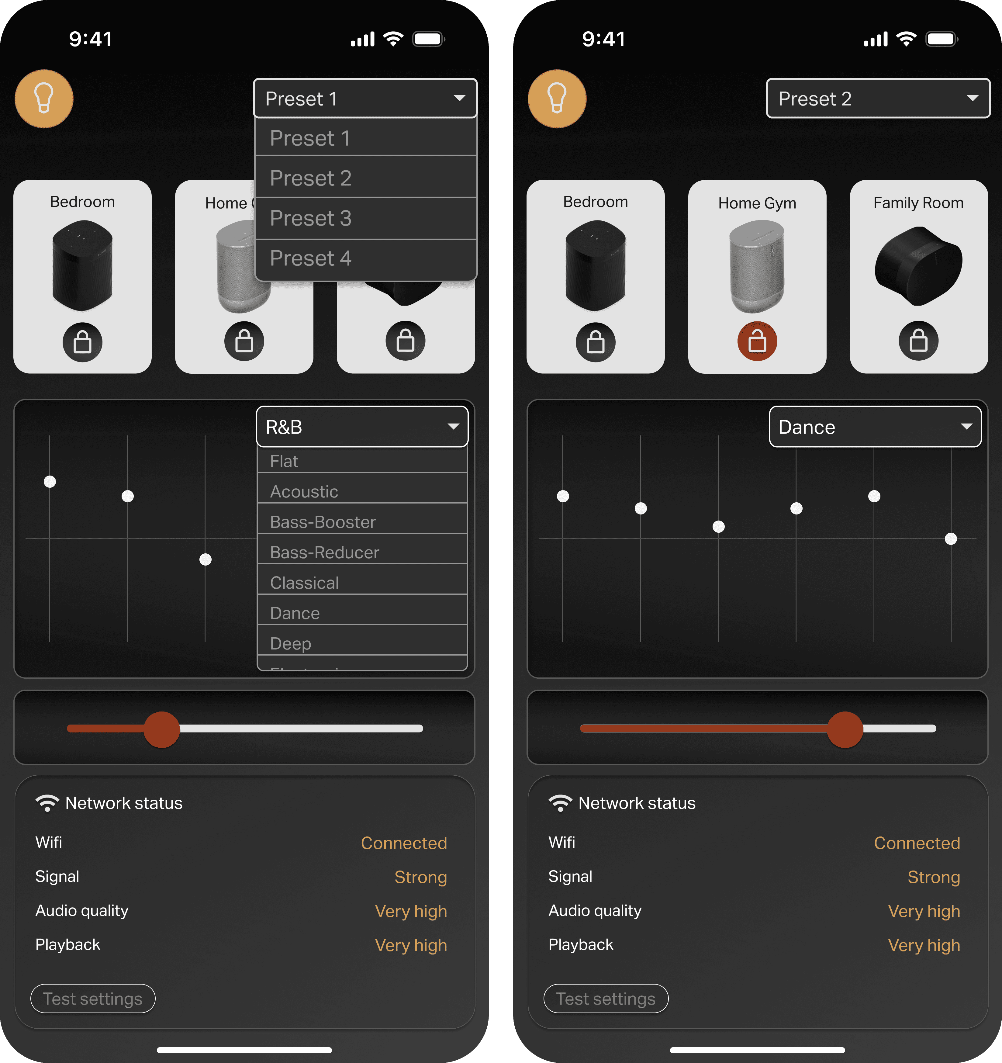
A key function of the app is the ability to control multiple speakers simultaneously. The intuitive interface makes it easy to switch between speakers and manage each one individually. A customisable hotbar allows users to personalise controls for each speaker in their system, ensuring every speaker is optimised for its specific use.
A key function of the app is the ability to control multiple speakers simultaneously. The intuitive interface makes it easy to switch between speakers and manage each one individually. A customisable hotbar allows users to personalise controls for each speaker in their system, ensuring every speaker is optimised for its specific use.


SPEAKERS
The speaker screen displays user-defined icons, allowing each speaker to be personalised. Users can easily adjust settings for each device in one place.
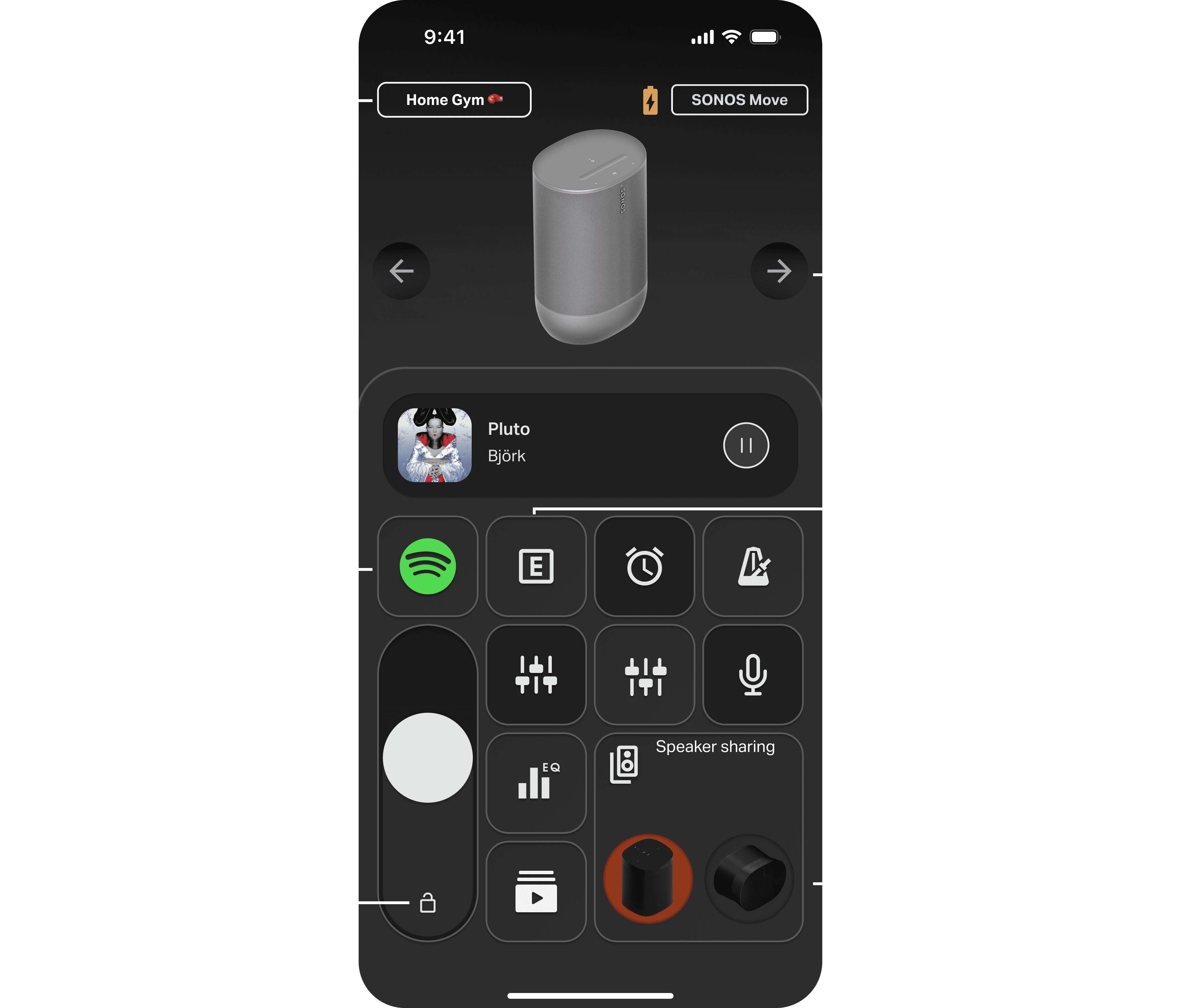
FIG. 4
DISPLAYED APP ICONS
DISPLAYED APP ICONS
FIG. 4
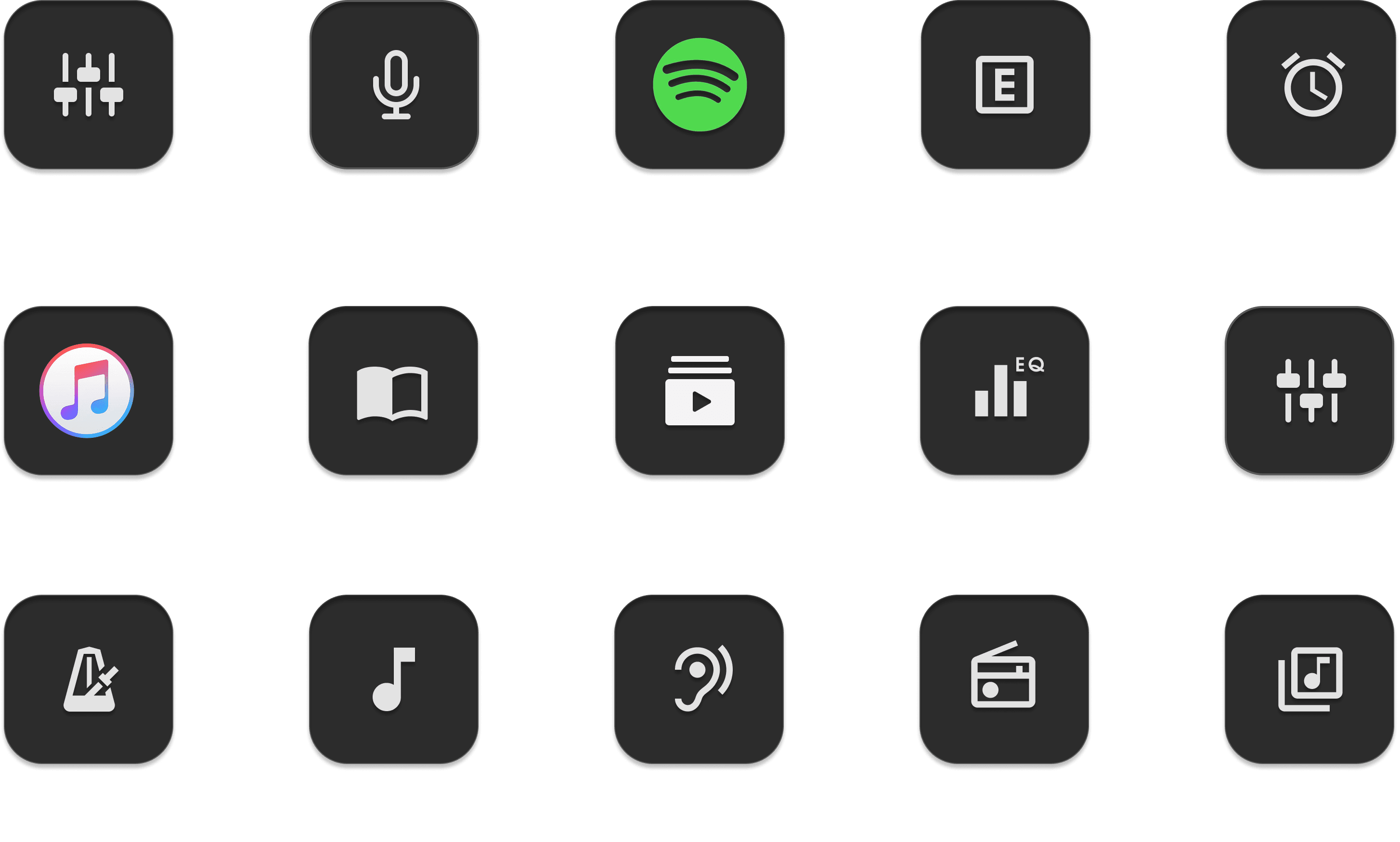

FIG. 4
LIBARY OF AVAILABLE APP ICONS
LIBARY OF AVAILABLE APP ICONS
FIG. 5
PRESETS
Users can now create default presets tailored to their needs, selecting which speakers are included and customising individual equaliser settings for each one.
Users can now create default presets tailored to their needs, selecting which speakers are included and customising individual equaliser settings for each one.

CONCLUDING SONOS CASE STUDY
CONCLUDING SONOS CASE STUDY
IMPACT
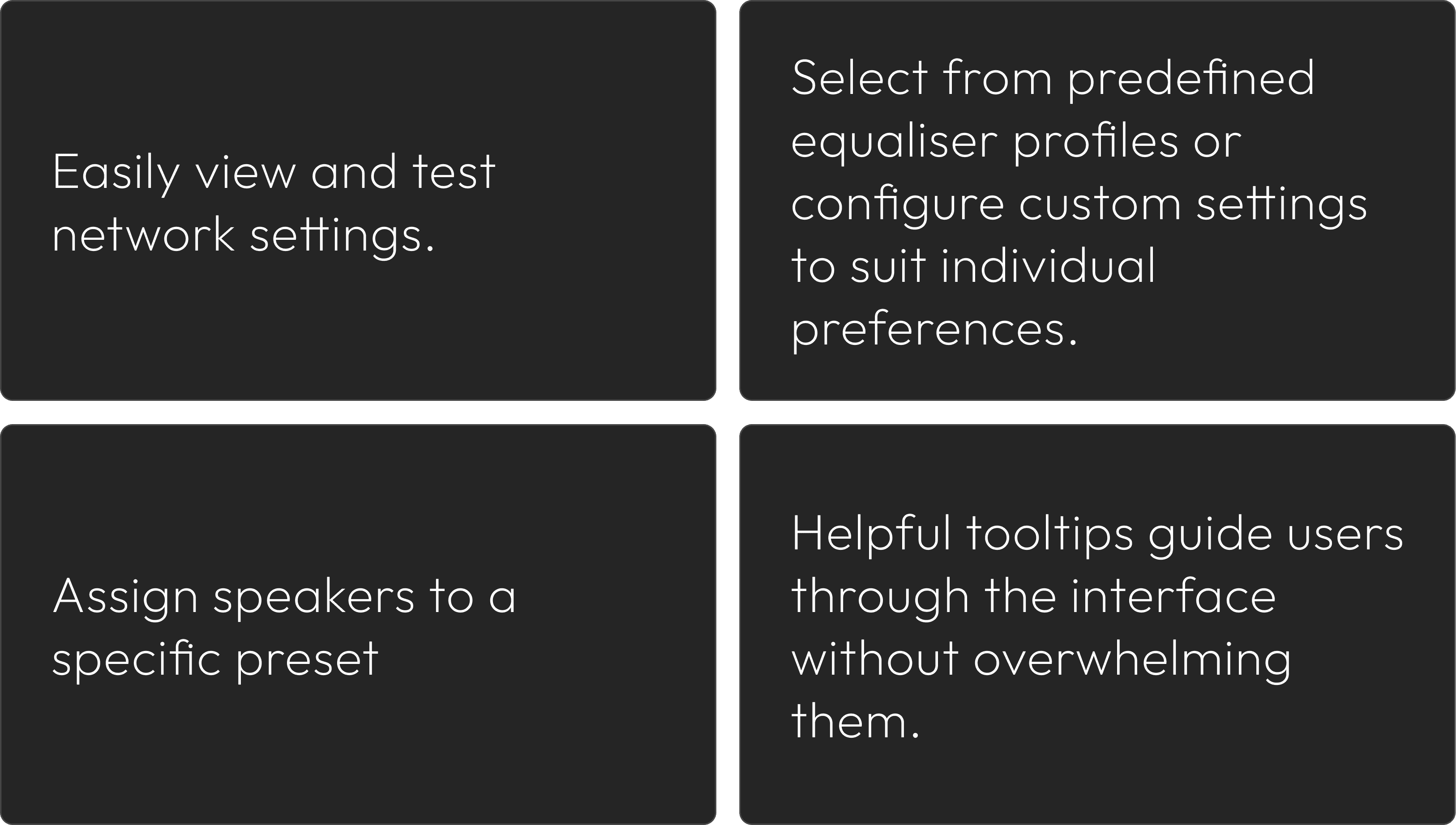
This being a personal project limits my ability to user test significantly. However, there are quantitative measures that can express how successful the re-design has been....
This being a personal project limits my ability to user test significantly. However, there are quantitative measures that can express how successful the re-design has been....
CHALLENGES
Gathering research and designing for a wide range of users came with several challenges. Catering to accessibility-dependent users was particularly complex. I aimed to preserve the premium feel of the Sonos brand through a dark, muted color palette, but had to make thoughtful compromises to ensure the design passed WCAG contrast requirements. Balancing aesthetic goals with usability and accessibility standards became a key part of the design process.
Gathering research and designing for a wide range of users came with several challenges. Catering to accessibility-dependent users was particularly complex. I aimed to preserve the premium feel of the Sonos brand through a dark, muted color palette, but had to make thoughtful compromises to ensure the design passed WCAG contrast requirements. Balancing aesthetic goals with usability and accessibility standards became a key part of the design process.
WHAT I WOULD DO DIFFERENTLY
I’d create a clear onboarding process to help users understand all core features from the start. While I’m familiar with every element I designed, usability testing showed that some icons were ambiguous, which impacted accessibility and ease of use.
I’d create a clear onboarding process to help users understand all core features from the start. While I’m familiar with every element I designed, usability testing showed that some icons were ambiguous, which impacted accessibility and ease of use.
CONCLUSION
The redesign addressed navigation frustration by thoughtfully positioning core functions where users expect them and using clear visual cues to guide interaction. By introducing customisable presets and volume locking, the app became not only easier to use but also more adaptable to individual preferences, creating a smoother, more personalised experience.
The redesign addressed navigation frustration by thoughtfully positioning core functions where users expect them and using clear visual cues to guide interaction. By introducing customisable presets and volume locking, the app became not only easier to use but also more adaptable to individual preferences, creating a smoother, more personalised experience.
While there’s room to expand on music features like radio, saved songs, and playlists, this case study focused mainly on enhancing speaker connection and management.
While there’s room to expand on music features like radio, saved songs, and playlists, this case study focused mainly on enhancing speaker connection and management.
This redesign reintroduces clarity and ease to the Sonos app, aligning the digital experience with the brand’s premium ecosystem. By simplifying key flows and core features, the app now better supports the users and reinforces the seamless experience Sonos is known for.
This redesign reintroduces clarity and ease to the Sonos app, aligning the digital experience with the brand’s premium ecosystem. By simplifying key flows and core features, the app now better supports the users and reinforces the seamless experience Sonos is known for.